Noz Brand & Digital Marketing
The Situation
This project focused on designing and launching an ecommerce store with a clearer brand identity and a more usable buying experience. The goal was not only to make the store visually consistent, but to build a structure that helped people compare products more easily, move through purchase decisions with less friction, and discover the store through both search and social channels.
The challenge was practical. An ecommerce store has to do several jobs at once: present products clearly, reduce uncertainty at the point of decision, and create enough structure for visibility beyond direct visits. That meant thinking about design, copy, navigation, search, and content as part of one system rather than as separate tasks.
The Approach
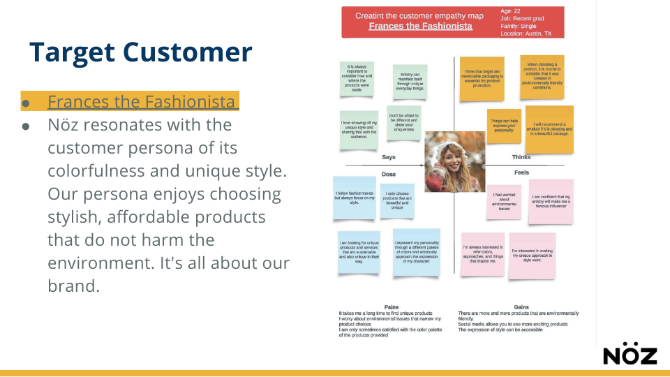
The work began with the buyer decision process. I segmented users by intent, distinguishing between visitors who were browsing, comparing options, and ready to buy. From there, I mapped the information each group needed in order to move forward, including product clarity, trust signals, shipping expectations, return information, and an easier comparison path across pages. These questions then informed page structure and copy hierarchy.
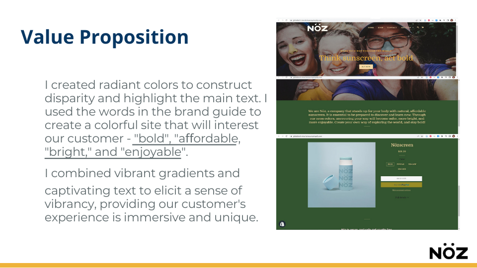
I also conducted market review across direct competitors and close substitutes to understand how similar stores presented products, framed pricing, placed trust signals, and structured calls to action. That research helped identify both category conventions and missed opportunities, which then shaped decisions about what the NOZ store should make obvious and which kinds of claims or patterns it should avoid.
On the store side, the work included design and launch as well as testing-oriented improvements to the user experience. I reviewed CTA placement, product visuals, and information hierarchy in order to reduce navigation friction and create a clearer path from discovery to product selection and add-to-cart behavior. Product and collection pages were simplified so visitors could scan and compare more easily without losing necessary detail.
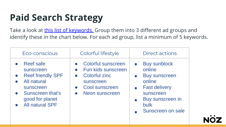
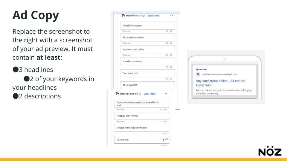
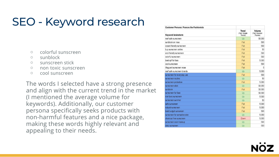
Search visibility was built into the structure as well. Keyword research informed category naming, product titles, metadata, and on-page copy, with attention to both readability and crawlability. Internal linking and site structure were adjusted to support clearer navigation for users and a more usable foundation for search.
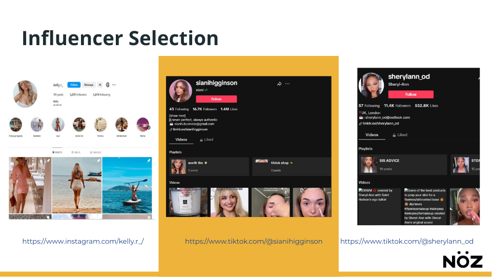
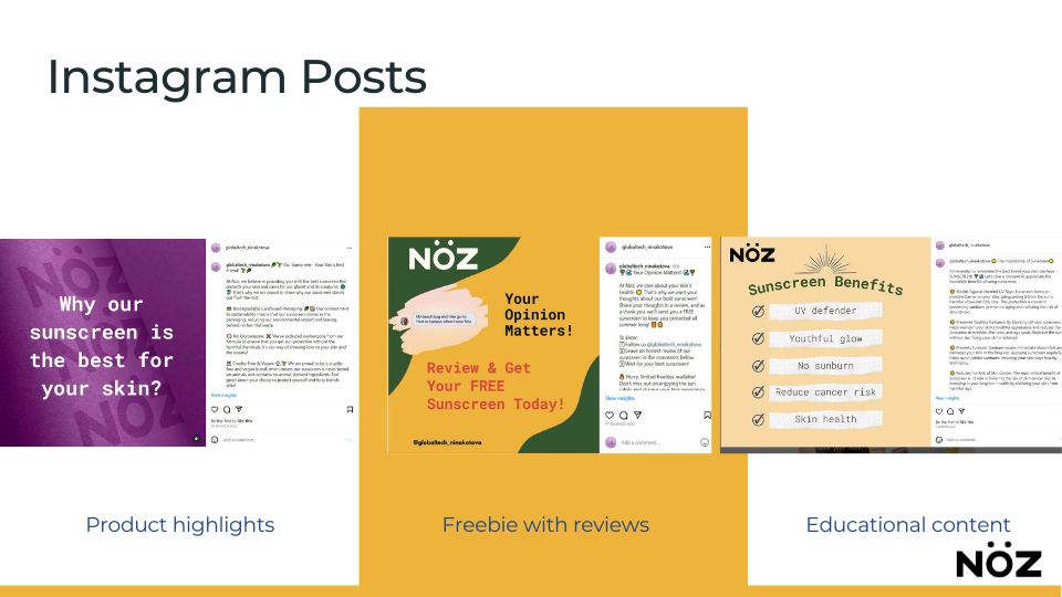
The project also included a social content plan tied to product discovery. Rather than treating social as a separate layer, I built it around recurring buyer questions and formats that could direct attention toward collection and product pages in a more intentional way.
Key Deliverables
Ecommerce store design and launch
Brand presentation system for a more consistent visual identity
Buyer-intent segmentation across browsing, comparing, and ready-to-buy stages
Page structure and copy hierarchy based on decision needs
Competitor and substitute review for category norms and gaps
UX improvements to CTA placement, product visuals, and information flow
Product and collection page simplification
SEO work on category naming, product titles, metadata, and on-page copy
Internal linking and crawl-friendly site structure
Social content plan tied to discovery and buyer questions
The Results
The store launched with a more consistent brand presentation, a clearer product comparison experience, and a stronger structural foundation for both usability and discoverability. Product pages became easier to scan, the path from browsing to purchase became more direct, and the store was better positioned to support ongoing traffic from search and social rather than relying only on design alone.