

The White Space Effect: How Emptiness Creates Meaning
Introduction: Why Emptiness Works
When we see a minimalist interior, a restrained web layout, a quiet logo, or a page of text with generous margins and loose line spacing, something happens. We feel lightness. Breathing space. Calm.
And although it seems like “nothing” is there, that very “nothing” often becomes the main character. It directs attention, amplifies meaning, and gives importance to what remains.
At first glance, this sounds paradoxical: how can absence create presence? But white space is not an absence at all. It’s an active element, a deliberate silence that gives form to what surrounds it.
In this article, I’ll explore:
What white space actually is — its forms and roots.
Why emptiness creates meaning — the psychology behind it.
How white space operates in design, branding, architecture, and writing.
When emptiness works — and when it doesn’t.
What balance looks like in practice.
And yes — I still question, often — how much emptiness is enough? But perhaps that uncertainty is what keeps the work alive.
1. What Is White (Negative) Space?
1.1 Definition and Terms
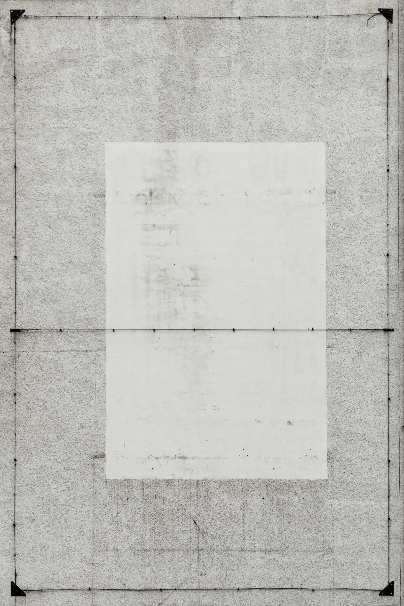
White space — also known as negative space — is the portion of a design or composition left unmarked. It’s the area that contains no text, no images, no decorative shapes — nothing.
As Canva (2025) explains, white space doesn’t have to be literally white. It can be any color, texture, or background that remains intentionally free of competing details. What matters is not its color, but its emptiness.
Designers usually distinguish between:
Micro white space — the small gaps between letters, words, lines, and icons.
Macro white space — the larger open zones between blocks of content, margins, and columns.
Active white space — emptiness deliberately used to draw attention or emphasize something.
Passive white space — the automatic gaps that appear as a natural result of layout or formatting.
In art and perception theory, the concept of negative space is tied to the figure–ground principle: the idea that what’s “background” can also shape the figure itself. The famous “Rubin’s vase” optical illusion — where a vase and two faces share the same outline — shows how emptiness defines presence.
1.2 Historical and Cultural Roots
The notion of emptiness as a form is ancient. In Japanese aesthetics, the concept of “ma” (間) describes the pause, the interval, the breathing space between things. It’s not “nothingness” — it’s the charged space that gives meaning to everything else.
Western modernism rediscovered this principle in the 20th century. Minimalism, Bauhaus, and modern architecture — think Ludwig Mies van der Rohe’s “less is more” — all treated emptiness not as a lack, but as an instrument of clarity.
In contemporary graphic design, typography, and branding, white space has become synonymous with elegance and focus — a mark of control and restraint.
2. Why Emptiness Amplifies Meaning
2.1 Reducing Noise and Cognitive Load
Every visual element competes for attention: color, line, text, image. When too many appear together, the viewer’s mind becomes overloaded — a kind of visual noise.
White space functions as a pause, a resting zone for the eyes and brain. It reduces cognitive load and makes it easier for attention to settle where it matters.
According to Shift eLearning (2025), layouts with more deliberate white space improve readability and comprehension. The eye follows structure more naturally when it’s allowed to breathe.
2.2 Emphasis Through Contrast
Emptiness around an element acts like a frame — or a silence around a note. It amplifies importance by contrast.
This follows the figure–ground effect: the more empty the background, the clearer the figure. The less distraction, the stronger the signal.
In this sense, white space is not passive. It’s an active amplifier.
2.3 Creating Visual Hierarchy

White space organizes content. It guides the eye from one idea to the next, marking what belongs together and what stands apart.
The best designers use emptiness as a directional tool — a visual pathfinder that silently says: “start here.”
2.4 Simplicity and Perceived Quality
Humans associate simplicity with quality. The aesthetic–usability effect shows that clean, minimalist designs are perceived as more trustworthy and more intuitive.
Brands that “own their silence” — that leave generous space around their message — project confidence. Too much information often signals insecurity.
2.5 Time and Pause
White space doesn’t just slow the eye; it slows time.
Like a musical rest, it allows rhythm and emphasis to emerge. The viewer lingers longer, absorbing the message rather than skimming through it.
Good design, like good writing, depends as much on its silences as on its words.
3. Practice: How White Space Works in the Real World
3.1 Graphic and Digital Design
In web and product design, white space is now an essential compositional tool — not decoration, but strategy.
Common patterns include:
Wide margins and generous padding around text and images — creating “breathing zones.”
One focal point per screen, surrounded by emptiness.
Minimalist landing pages: a single image, a line of copy, a single call to action.
Card layouts with ample space around each module.
Typography with expanded line height (130–150%) and increased paragraph spacing.
According to Attention Insight (2020), call-to-action buttons with more surrounding white space attract up to 20% more clicks. The visual isolation makes them feel deliberate — and thus trustworthy.
But balance matters: on small mobile screens, too much emptiness can force excess scrolling, breaking the rhythm.
3.2 Branding and Logos
In branding, white space signals confidence.
Most brand style guides include “clear space” rules — defined margins that must surround a logo so it can breathe. Premium brands (Apple, Chanel, Tesla) often build entire visual systems around restraint and simplicity.
Emptiness here becomes part of identity: a sign that the brand doesn’t need to shout.
3.3 Architecture and Interiors
Minimalist architecture applies the same logic spatially: walls, light, proportion, and emptiness.
Open layouts, unadorned surfaces, and deliberate voids turn space itself into a material. As Japanese architect Tadao Ando put it, “Space itself is the building.”
Museums use the same strategy — a single sculpture on an empty floor, a painting on a bare wall — to transform absence into reverence.
3.4 Writing and Editorial Design
In writing, white space lives in the margins, in paragraph breaks, in the pause between sections.
Good typographers know: space sets tone. A text crowded to the edges feels anxious; a page with room around its words invites thought.
Poets use emptiness visually — shaping silence into rhythm. The blank area on a page becomes an extension of voice.
In nonfiction and longform publishing, white space frames key quotes, breaks heavy text, and introduces breathing intervals that sustain focus.

4. When Emptiness Works — and When It Doesn’t
4.1 The Successful Kind of Nothing
Classic examples of white space mastery include:
FedEx: the hidden arrow between the “E” and “x” — meaning revealed through absence.
CBS Eye: a symbol designed in the 1950s whose power lies in the clarity of its surrounding void.
Apple and NIKE campaigns: a single product or sentence floating in space.
In galleries, the “white cube” exhibition model — empty walls, neutral light — turns attention inward, transforming looking into meditation.
And in digital design, products like Notion or Medium build their aesthetic (and emotional) appeal precisely on restraint.
4.2 The Failed Kind of Nothing
Yet emptiness can fail.
When space isn’t intentional — when it’s just unfilled — it becomes dead air. The viewer reads it as absence, not calm.
Other pitfalls include:
Over-minimalism, which feels cold or underdesigned.
Usability issues, especially on mobile — too much space between sections forces endless scrolling.
Mismatched context: in information-dense dashboards or news platforms, wide emptiness can feel inefficient or unserious.
Commercial tension: marketing teams often push for more content, more CTAs, more promotions — squeezing out silence entirely.
And sometimes, designers simply fall in love with emptiness itself, forgetting its purpose. Space without intention doesn’t communicate. It just… vanishes.
5. The Human Side of Space
I’ve often thought about why we respond emotionally to emptiness.
Maybe it’s because in a noisy world, silence feels like luxury.
Or maybe it’s because space, like trust, can’t be faked — you have to allow it.
In creative work, restraint takes courage. It means believing your message is strong enough to stand alone, unadorned.
White space, in that sense, is a form of respect — for the viewer, the reader, the idea itself.
6. Working with White Space: Principles and Balance
Here are a few grounding ideas for using emptiness with intention (not as “tips,” but as reminders):
6.1 Start with Structure
Build from a grid.
Define consistent margins, gutters, and modular spacing.
Let proportions, not decoration, create beauty.
6.2 Identify the Center
Decide what deserves attention — a headline, an image, a phrase — and clear everything around it.
Space is the strongest frame there is.
6.3 Let Typography Breathe
Use generous line height and paragraph spacing. Keep text away from edges. Allow margins to serve as visual lungs.
6.4 Shape Meaning with Negative Form
Sometimes the surrounding void creates a secondary image — a silhouette emerging from absence. The FedEx arrow. The hidden cup between two faces.
Designers who master this understand: the shape of nothing is still a shape.
6.5 Test Your Silences
In digital contexts, test variations — more space, less space — and observe behavior.
Which layout makes readers linger? Which feels lighter, truer to your intent?
Good white space is not decorative; it’s functional empathy.
6.6 Adapt to Context
What feels serene on a 27-inch monitor might feel wasteful on a phone.
On print, margins can expand; on mobile, they might need compression.
Adjust, but never eliminate the breath entirely.
6.7 Extend the Idea Beyond the Visual
White space is not limited to design. It’s a narrative and psychological tool, too.
In writing, pauses matter — a single line alone on a page can carry more weight than a paragraph of explanation.
In storytelling and presentations, silence, pause, and omission create rhythm.
Meaning often hides in what’s deliberately unsaid.
7. Reflection: The Space That Holds
White space is not absence. It’s the structure that holds everything together — the silence that makes sound meaningful.
In both design and life, presence gains strength from its edges — from what it’s not.
Too much emptiness, and we drift. Too little, and we suffocate. Somewhere between the two lies clarity.
There is no formula for balance. Each composition, each page, each moment demands its own measure of pause.
Perhaps the real mastery lies not in what we place — but in what we allow to remain untouched.
In your latest project, how much space did you leave — for the eye, for the reader, for yourself?