

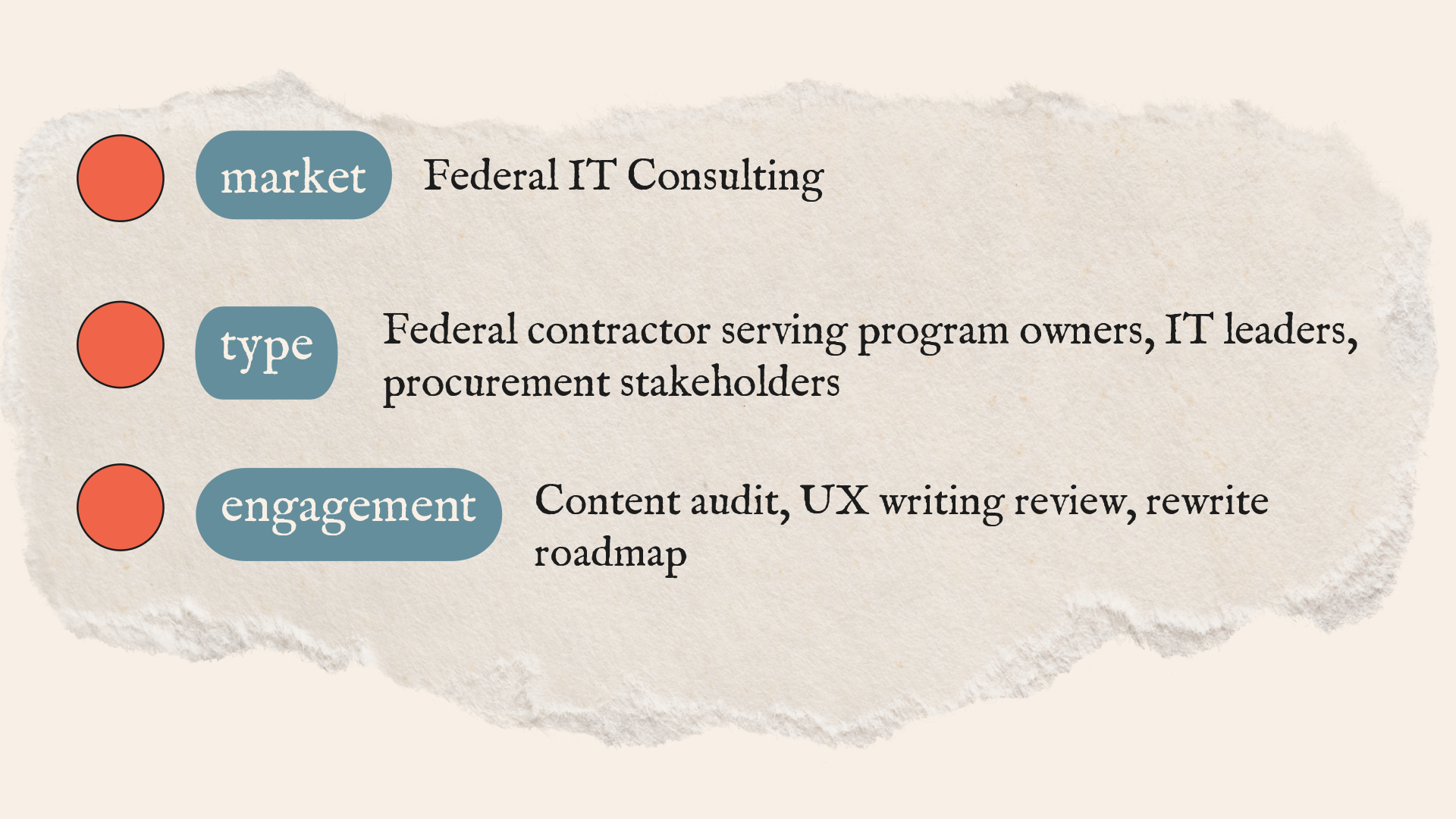
Website Audit & UX Writing Roadmap for a Federal IT Contractor
The Situation
Federal buyers don't evaluate vendors the way commercial buyers do. They scan for specific signals: capability, compliance track record, clear outcomes, and evidence the firm has done this before. They're cautious by design and short on time.
This federal IT contractor had real capabilities. Strong delivery history, experienced teams, legitimate differentiators. But the website wasn't communicating any of it in a way the right people could use.
Solution pages were written for people who already understood the work, not for program managers and procurement officers doing initial capability checks. Services were described as technology categories, not as buyer decisions. The proof that existed was either missing, scattered, or buried in a single blog post nobody navigated to.
The result: a site that looked credible enough to not raise red flags, but didn't give evaluators a compelling reason to shortlist the firm.
The problem wasn’t the company’s capability, it was the gap between what federal buyers needed to see and what the website actually made easy to understand.
The Approach
To understand why the site wasn’t helping the right buyers move forward, I audited it through the logic of a federal capability review rather than through a standard website structure lens.
The audit started with the buyer's decision process, not the site structure.
I mapped what federal evaluators are actually looking for during a capability check: plain-language descriptions of what the firm does, concrete evidence it has worked before, and a clear path to the information needed to make a shortlist decision. Then I evaluated every core page against that standard.
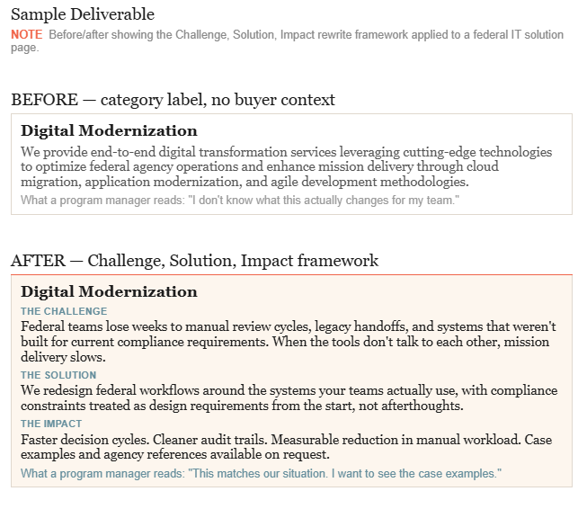
Findings were specific. Solution pages leaned technical and abstract. Services were framed as labels rather than decisions a buyer could evaluate. Proof was thin: logos without context, a single success stories page instead of a navigable library, no micro-metrics inside page text near the claims they were meant to support.
From those findings I built a prioritized rewrite roadmap using the Challenge, Solution, Impact framework across all solution pages, a scalable proof system starting with a case library structure, and a homepage fix that leads with a keyword-driven H1 and clear buyer paths.
Results
Full audit across homepage, solutions, About, Careers, Blog, and Success Stories with specific findings for each section
Rewrite system for all solution pages using Challenge, Solution, Impact framework with sample copy direction
Prioritized fix list organized by impact: proof placement, case library structure, navigation, internal distribution
SEO implementation guide: H1 structure, metadata, FAQ blocks, internal linking
Homepage rewrite direction with keyword-led H1 and top-of-page proof line
A note on this work
UX writing for federal contractors isn't a standard content marketing assignment. The buyer is skeptical by training, the stakes of every evaluation are high, and making the shortlist often comes down to whether a program manager can quickly understand what you do and find the evidence to support it. That's a research and structure problem as much as a writing one.